How many different ways can a million people look?
What am I looking at?
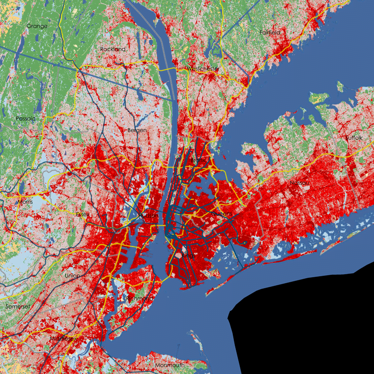
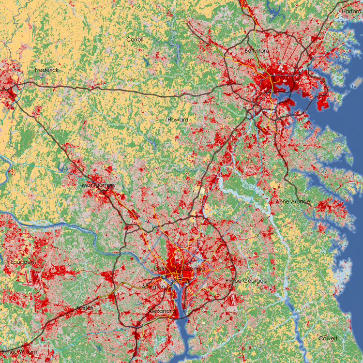
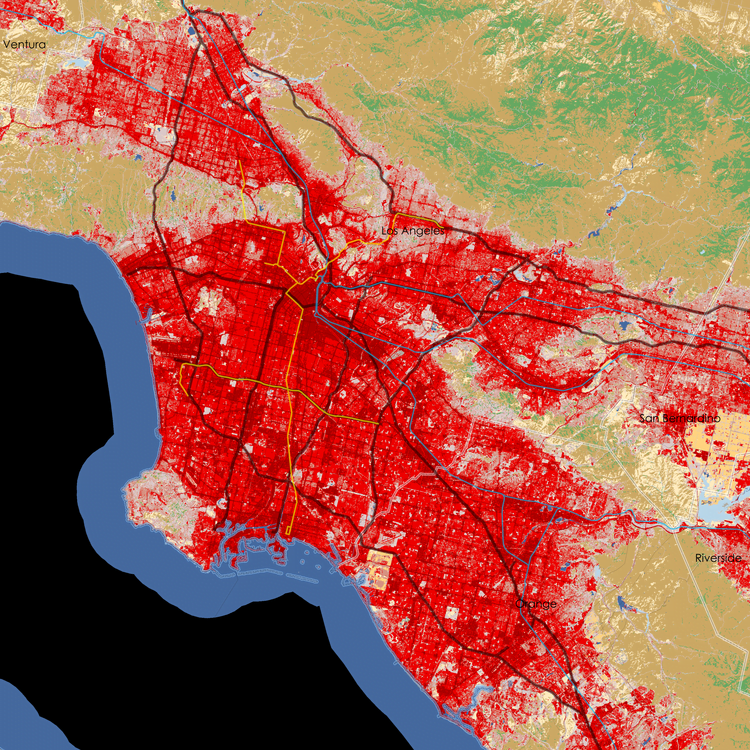
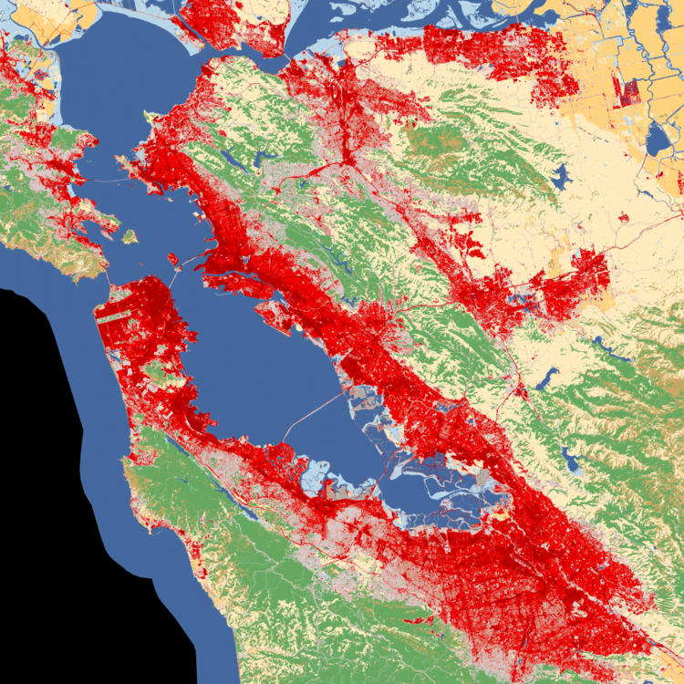
This gallery is designed to compare the footprints of different American cities. Slide through the thumbnails at the bottom of each image to choose up to four to compare. Each image is projected at the same scale (1:250k) and depicts simplified land cover data, including developed area. The population figure reflects the number of people visible at this scale regardless of administrative boundaries.
Part of my goal with this post was to invite comparisons and start a conversation. If this provokes your curiosity, go ahead and add a comment.
To learn more about land cover data and how it can help us understand cities click here.
Land Cover Data: 2011 National Land Cover Dataset
Population: 2010 Census Tracts